Visual Communication
and Design
Explore a collection of my visual communication design work, including layouts, graphics, and creative design projects. These pieces showcase my ability to communicate ideas visually, apply design principles effectively, and create engaging, audience-focused content. Each project reflects the skills I’ve developed in typography, color, composition, and design software, highlighting my growth as a visual storyteller and communicator.
Book
covers
This project explores visual communication through two book cover designs: one using dynamic center-line symmetry and one using asymmetry. The focus was on composition, hierarchy, movement, and balance rather than just creativity.
Each design uses cut-out objects, textured backgrounds, and intentional typography to create clear focal points and visual flow. The symmetrical layout guides the viewer’s eye along a central axis, while the asymmetrical design uses uneven visual weight to create a more dynamic, circular or triangular movement.
Overall, this project demonstrates my ability to apply design principles to create visually engaging and well-structured layouts.

symmetrical book cover
This design emphasizes symmetrical balance, clear hierarchy and controlled movement to create a cohesive and visually engaging composition. The hierarchy is immediately established through the typography within the title, Everything I Never Told You, dominating the center of the design. The large, script-style "Everything" commands attention, while "Told You" anchors the lower portion into stability. Supporting text is minimized in size to allow the title to remain the primary focus.
The composition is driven by symmetrical balance, created through the mirrored positioning of the two arms reaching toward the center. Each side of the design contains a similar arm extending outwards and establishing a clear vertical axis through the middle of the layout. This creates approximate symmetry, where visual weight is evenly distributed across both sides. The center titles reinforces this balance and creates stability throughout.
Movement is subtle and controlled as the viewer's eyes are guided inwards from both sides of the arms, this is converged at the center where both hands meet. The eyes then move through the stacked title, and the gentle movement of water in the background adds texture without disrupting the overall stability.
Additional principles such as contrast and repetition strengthen the design. The light-colored typography stands out against the dark water, ensuring readability. The repeated wave pattern creates a consistent visual rhythm, while the mirrored gesture of the hands reinforces unity and connection.
All in all, this design is visually compelling because in relies on balance and structure rather than tension. The symmetrical arrangement creates a sense of focus and harmony, while the clear hierarchy and subtle movement guide the viewer through the composition in a smooth and intentional way.
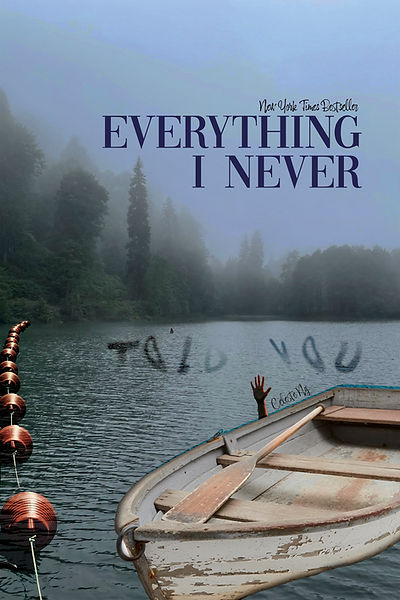
asymmetrical book cover
This design uses hierarchy, movement and asymmetrical balance to create a visually compelling and emotionally engaging composition. The hierarchy is clearly established through scale, placement and contrast. The boat and raised hand serving as the primary focal point. Their size, detail and placement in the foreground immediately draw the viewer's attention and create a strong emotional impact. The title, Everything I Never Told You, functions as the secondary element, positioned at the top and large enough to be read, but not overpowering. Additional information, like "New York Times Best Seller" and the buoys act as tertiary elements, while "Told You" blends into the environment to encourage close investigation.
Movement is created through directional cues and compositional flow. The viewer's eye is first drawn to the boat and hand, and then moves up toward the title. The diagonal angle of the boat and oar guides the eyes across the page while the words "Told You" pulls the viewers eyes into the water. The buoys create a leading line that brings the eyes back across the image, forming a continuous visual path.
The design demonstrates asymmetrical balance by distributing visual weight unevenly, but intentionally. The right side carries more weight due to the large, detailed boat and the human hand, which creates strong visual and emotional emphasis. This is balanced by the left side through the repetition of buoys and the negative space of open water. The composition feels stable because the visual weight is distributed thoughtfully.
Repetition and contrast enhance the design as well. The repeated buoys create rhythm and guide the viewer's eye, while the contrast between the darker water, foggy background, and light boat increase visual interest. The muted color palette and fog contribute to the overall mood, and reinforce a sense of tension and mystery.
The design is visually compelling because it combines strong compositional structure with emotional storytelling. The use of hierarchy emphasizes the boat as the central focal point, movement then guides the viewer through the composition, and asymmetrical balance creates dynamic tension to create a visually impactful design.